
Path&Penn
Streamlining Enrollment for an Intuitive Student Experience
providing context
What’s Path@Penn?
In spring 2024, I collaborated with UPenn as a UI/UX Designer to redefine the Path@Penn platform—a centralized student portal for course registration, academic records, and degree planning. Infamously known for its outdated and confusing interface, Path@Penn left students frustrated and struggling to navigate their academic planning process efficiently.
My role was to transform this platform by reimagining the homepage and enrollment process, as well as creating a responsive mobile experience. The goal was to develop a streamlined, intuitive interface that aligned with Penn’s brand identity while making course planning and resource discovery accessible to all students. Through strategic updates in information architecture, responsive design, and visual language, I crafted a solution that modernized Path@Penn and enhanced its usability across devices.
THE CHALLENGE
How can I help college students at Penn easily navigate their academic journey and access the resources they need to succeed?
the Solution
Empowering students to explore any of their academic aspirations

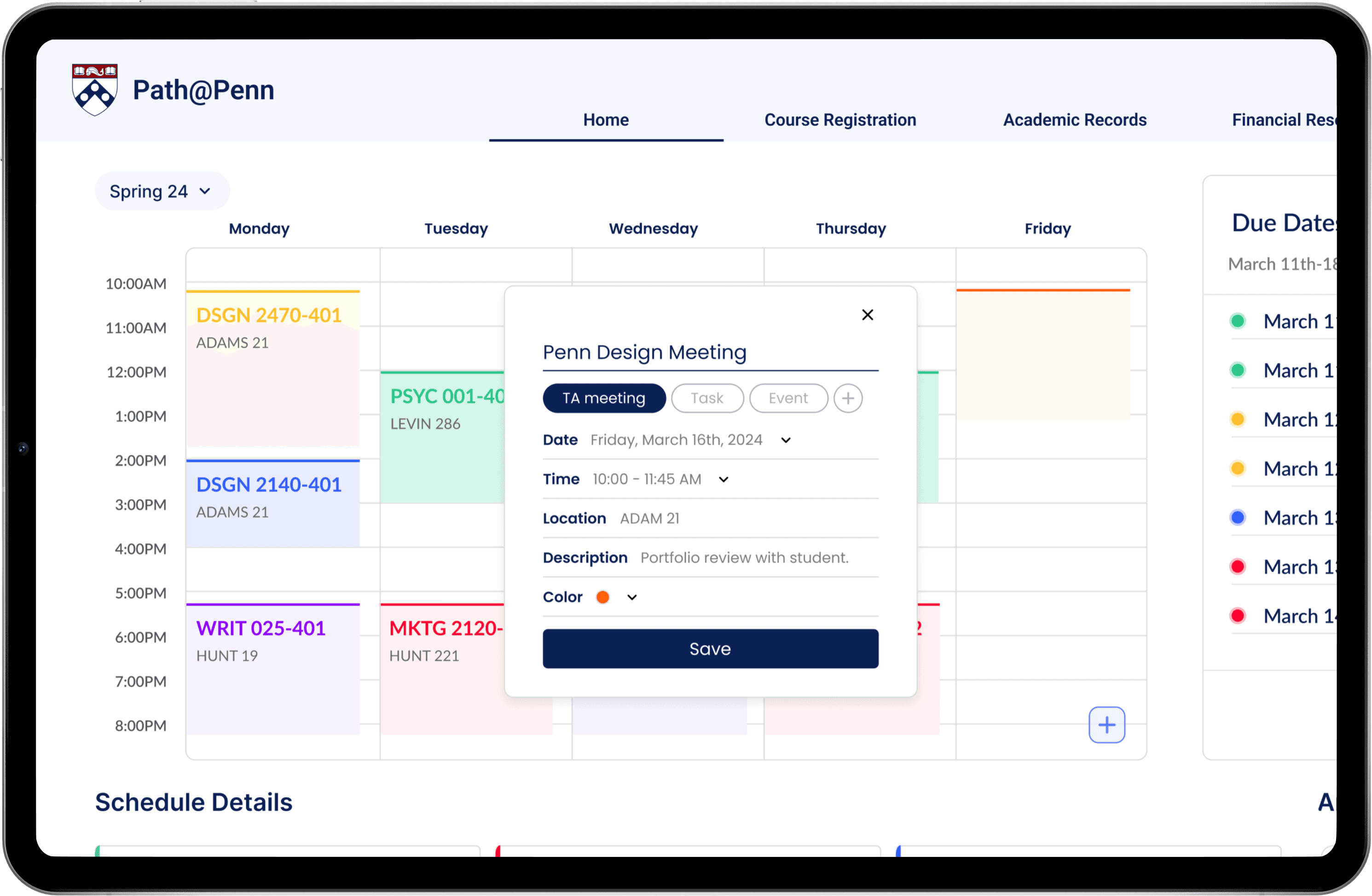
Homepage
Degree Planning

Calendar Integration

Mobile Optimization


PROBLEM DISCOVERY
Identifying key challenges in the Path@Penn platform
Path@Penn’s outdated design and functionality created significant barriers for students trying to navigate their academic journey. Taking a deep dive into the platform we identified three primary issues:
PROBLEM 1
Outdated design system
Path@Penn’s outdated design lacks cohesiveness and usability, making it difficult for students to navigate and find essential information.

Excessive empty space contrasts with key information cramped into one corner, creating a cluttered feel.
PROBLEM 2
Confusing organization/navigation
Repetitive links and an overwhelming number of menus and submenus disrupt user flow and could be consolidated for a smoother experience.


PROBLEM 3
Unresponsive mobile
Opening Path@Penn on mobile displays the desktop layout, forcing users to zoom and pan. Selecting a hidden “Mobile” button reveals a completely different and inconsistent interface.

DESIGN PROCESS
Following the Double Diamond model
To guide my problem-solving and solution development, I deployed the Double Diamond design model. This iterative framework, ensured a comprehensive user-centered approach while maintaining flexibility throughout the project.

RESEARCH
Three main discovery pillars for our research phase
To guide my problem-solving and solution development, I deployed the Double Diamond design model. This iterative framework, ensured a comprehensive user-centered approach while maintaining flexibility throughout the project.
What internal/external resources do students use and what do they need to make their enrollment process easier?
Survey findings:
Students indicate that the four main features regularly used are their schedule, searching for a course, registering for a class, and checking their academic calendar.
Students struggle to easily discover resources provided by the university because the organization of content is overwhelming, sending users down a rabbit hole of external pages.
Interview findings:
The text sizes and colors make readability difficult, especially for users with visual impairments.
The degree progress tracking feature does not accurately display the students course requirements.
Many important action items require unnecessary clicks to reach.
DEFINE
Using my research insights, I formed "How Might We" statements to guide the design:
Eliminate and reorganize redundant information to streamline the user experience
Apply accessibility guidelines to develop new fonts, colors, and button styles
Incorporate class and professor ratings along with a customizable calendar that integrates with Google Calendar
Design a responsive mobile version that provides the same level of information and functionality as the webpage
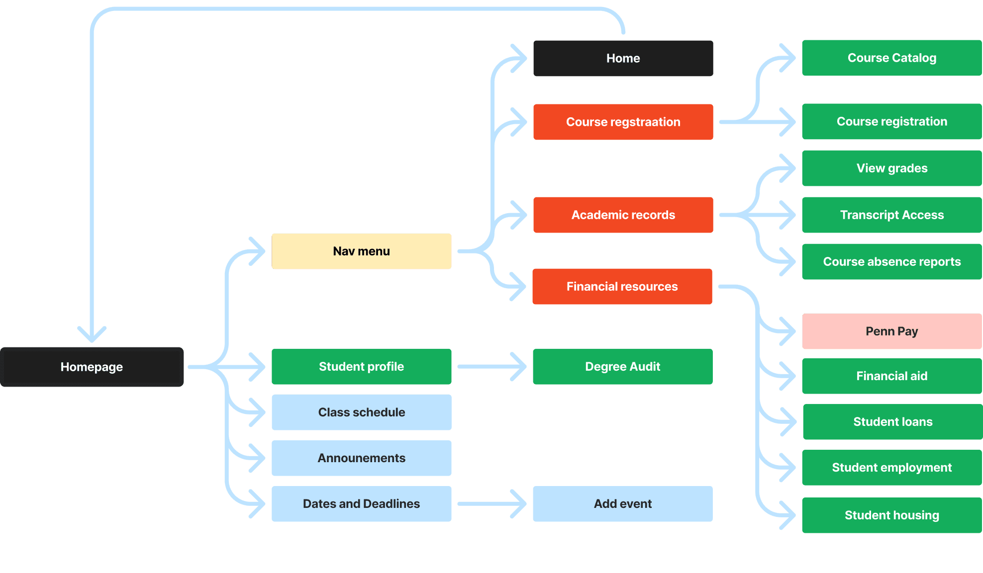
Restructuring the sitemap
develop
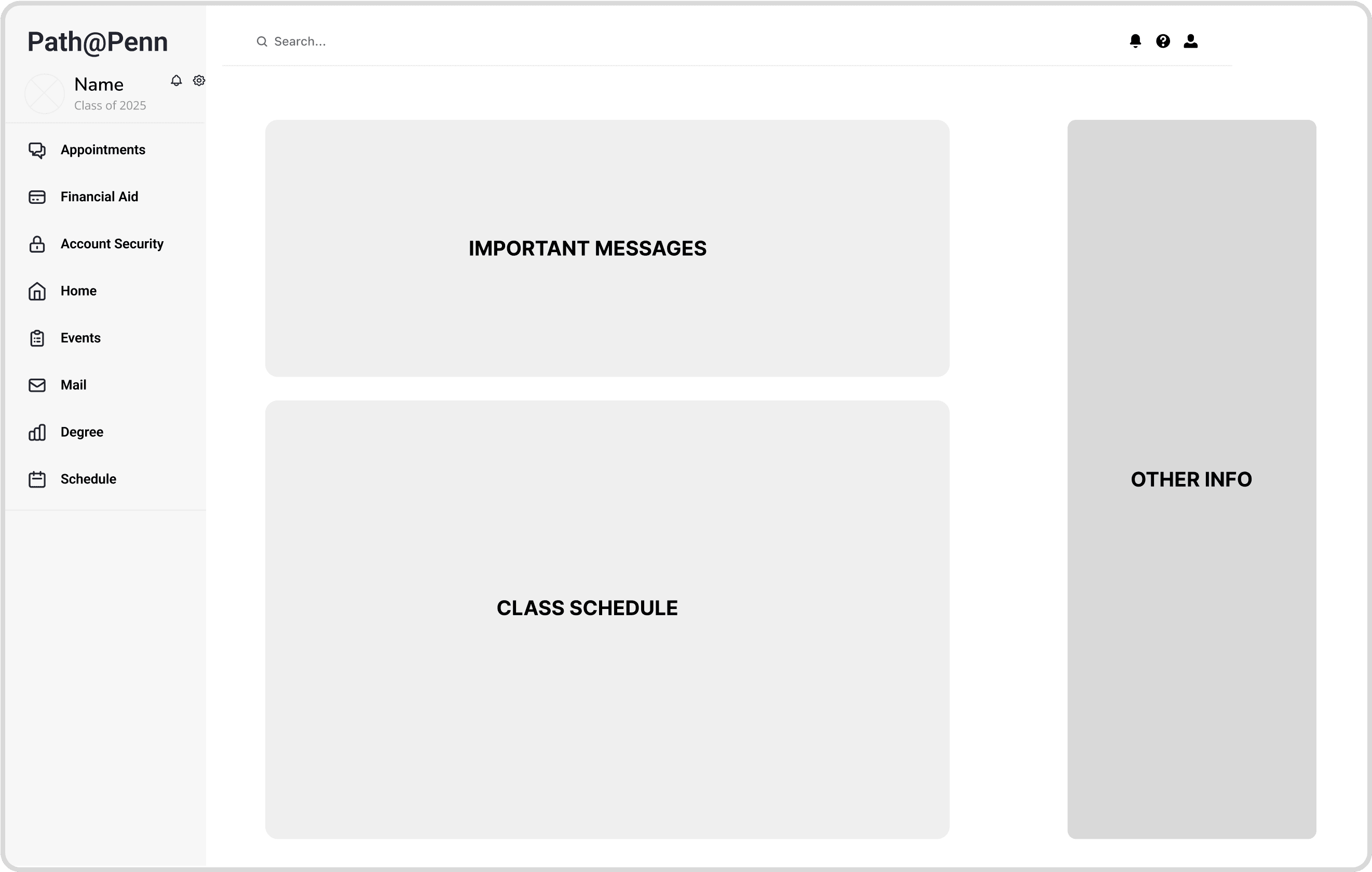
Guiding our early wireframes with resaerch


DELIVERY
How has the feedback we gathered helped us arrive at our solution?
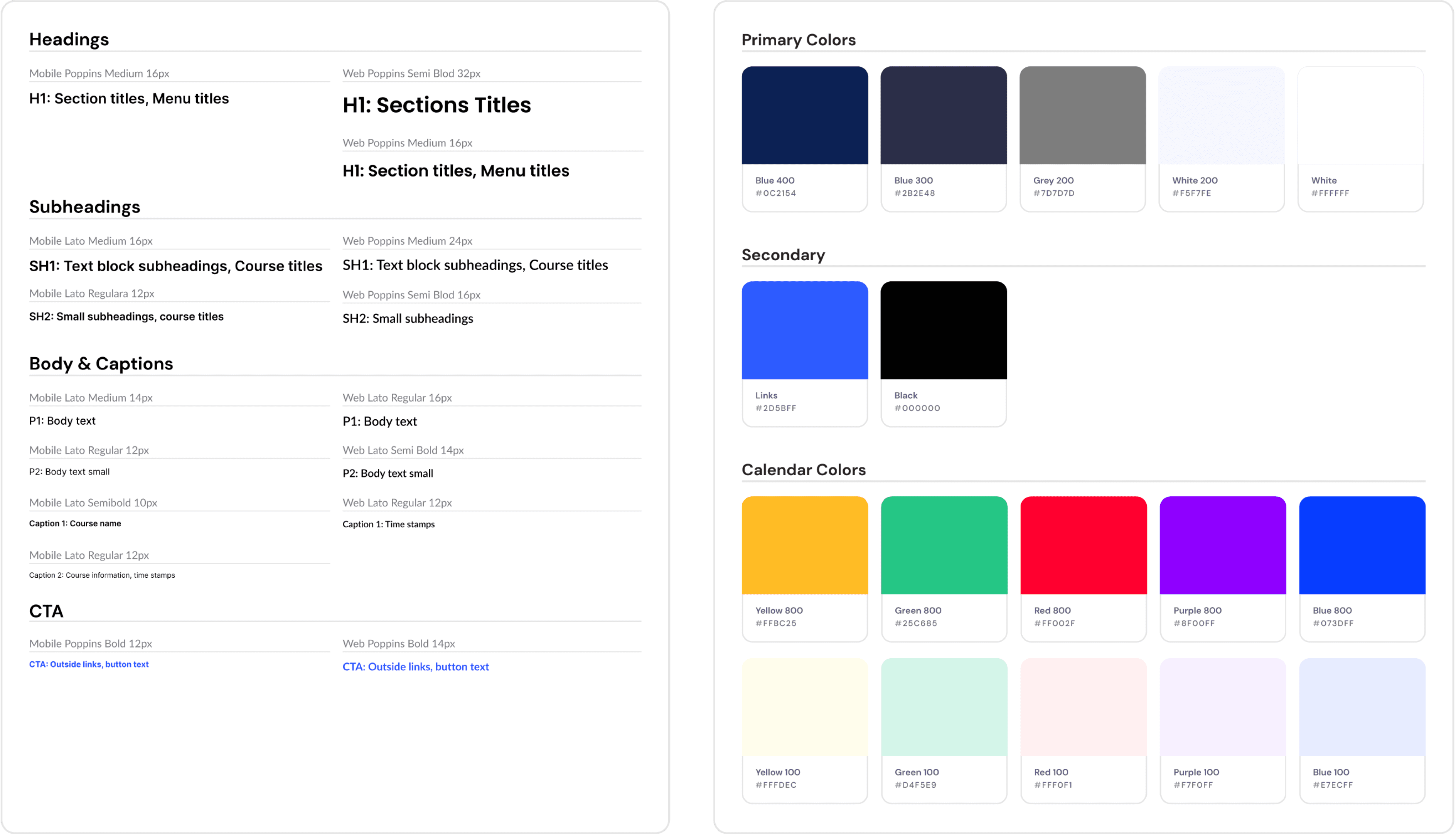
Design system development
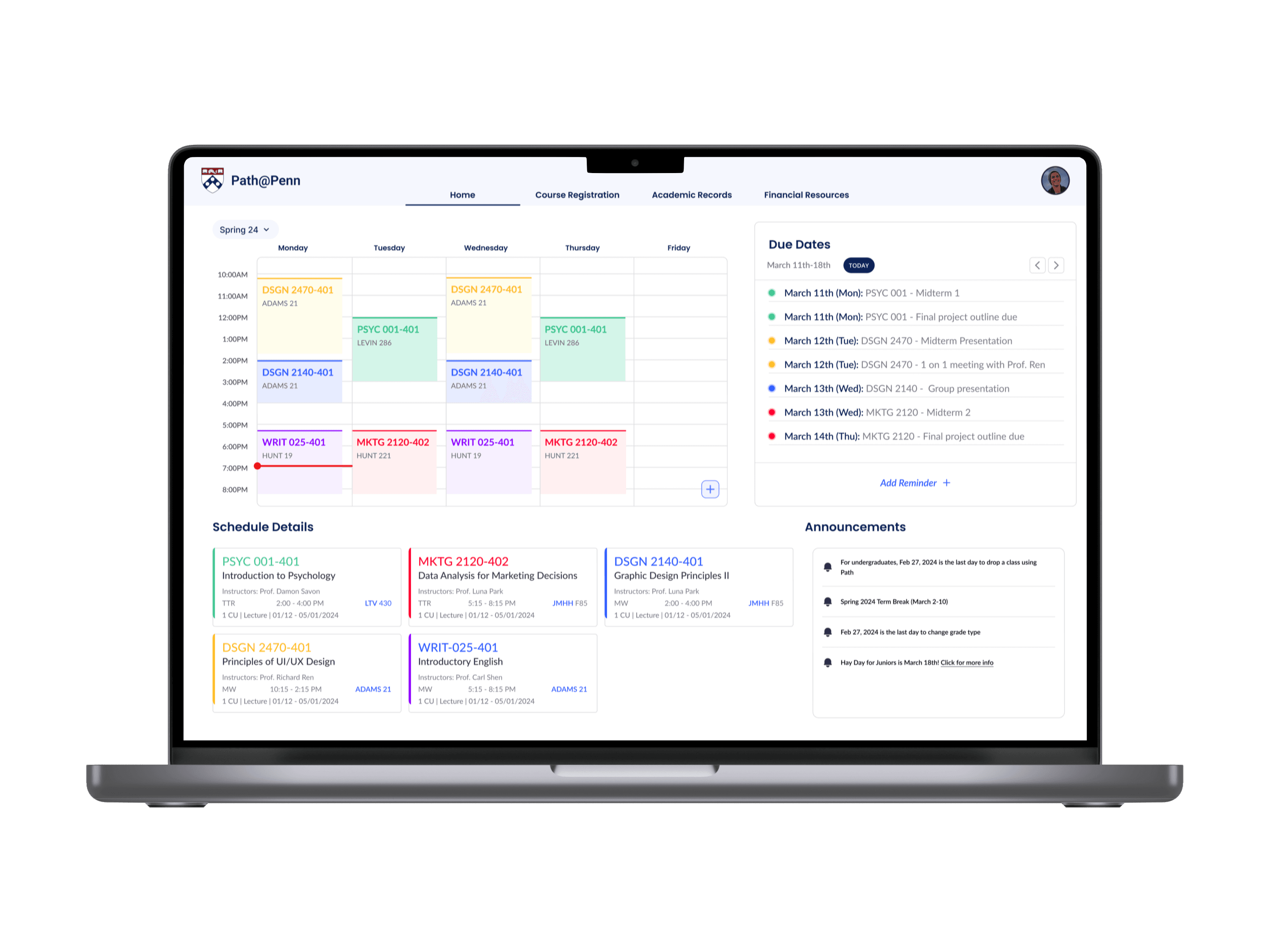
My primary goal in developing the new design system was to create a dashboard that provided a calming visual experience. To uphold Penn’s established branding, I used the same base colors and similar font choices. However, I introduced vibrant colors and modern button styles to achieve a cleaner and more contemporary aesthetic.
FINAL DESIGNS
A streamlined interface that empowers students to navigate all their academic pursuits
Login page

Homepage

Dashboard Customization
Degree Planning

Responsive Mobile Design

CONCLUSION